Two for One - with Vines of Love
Earlier this month a friend and I were at an independent paper craft store in the area, and I decided to pick up this Vines of Love die from Honey Bee Stamps. (I’ve been considering this die since it came out, and have more ideas with it.) This store has a great selection from Honey Bee Stamps, and I think it is important to support local when we can. Sometimes it is so nice to see product in person.
The first thing I wanted to do with this die was a pretty simple and direct use of it - but I wanted to make use of both the vine itself and the negative space left around it. Two for one cards always feel like a win.

Techniques:
I wanted to use the frame part left from die cutting the vine to create a shaker card. I made this one suitable to use as a wedding card, and kept that in mind when choosing shaker bits to put inside.
It would have been smart to use a double sided adhesive sheet on this cardstock before I die cut it, but I was away from home when I started this and didn’t have it with me. I got lucky though, and a lot of the die cut was tight to the die after cutting, so I carefully glued the back side of the frame portions and turned the whole thing down on a piece of clear packaging. (Again, I wasn’t home and din’t have foam tape or acetate, but I had the clear packaging from some stamp and die sets, so I used one of those that was the right size.
I was able to turn the whole thing over and rub the adhesive down from the back side - where I could see clearly what I was doing, before pulling off the die. I continued this, working in sections of the different die cuts.
I did the same technique for pieces that had separated from the die - placing them down and using the die to be sure the positioning was right before pressing it down. Using the liquid glue may have been more tedious than adhesive sheet, but it did give me the wiggle room I needed for positioning.
Low tack tape held the packaging and die cut together until I was sure the glue was dry.
Inside that packaging, I slid a piece of cream cardstock, and then filled it with a mix of festive and neutral sequins and sparkles. Cream cardstock provided nice contrast to the bolder blue front, and lets the shapes for the die show clearly. The frame has enough shape and pattern, so I knew I wanted to keep the inside of the shaker lighter and monochromatic.
This card is a 5x7, because I wanted to keep some border around the die cut vine, but that left me with some fairly plain space at the top and bottom of the card panel. I considered adding more vine die cuts or flowers, but decided a more simple geometric detail would be a better balance. The blanket stitched mini slimline die was the right size. I used the longer sides, trimmed the ends off and did a bit of ink blending on them in the same ink color as the cardstock before attaching them just in from the top and bottom edges. These detail strips were just enough to finish it off, adding pattern and texture that doesn’t compete with the vine.


Colors:
cardstock: Concord & 9th Blueberry and Harbor. Simon Says Stamp Cream.
ink: Concord & 9th Blueberry.
Techniques:
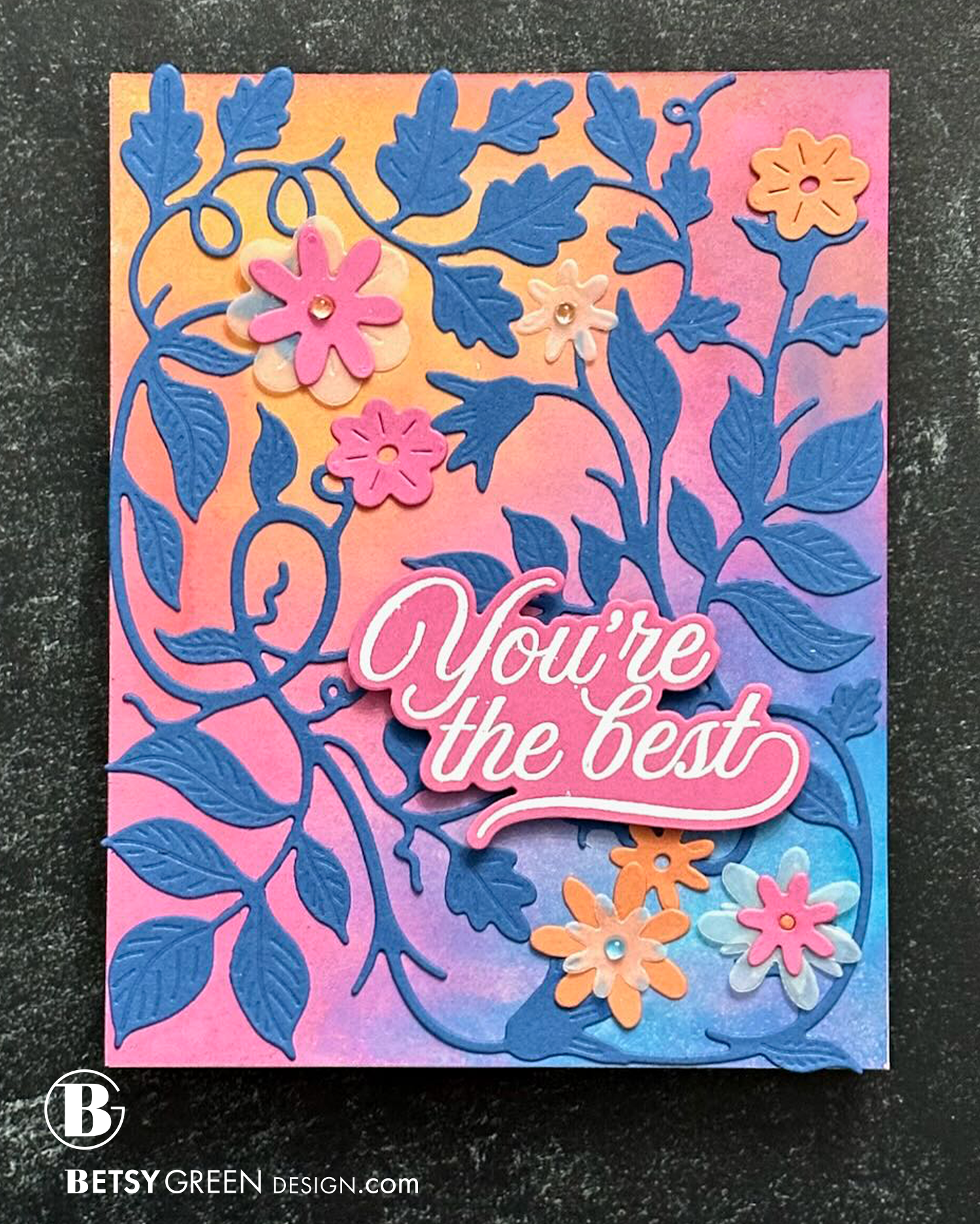
After making the first card, I still had the vine itself to use! I glued it onto an ink blended background.
There are hearts to use as flowers that come with the die, but I wanted a different feel for this one so I used a few different flower dies. I intentionally chose flowers with simple shapes, because I already had so much detail on the vine.
I’d intended to layer up the flowers in multiple colors, but it was too much with the color of the background and detail from the vine. Keeping it simple was much better balance.
Mixing in some vellum flowers cut from the same collection of flower dies added in a subtle detail and some depth, without covering too much.
A few small clear dew drops placed on three of the flower centers add a small touch of shine. (A fun thing about the clear gems like these is that the domed shape accentuates whatever color is below them, so the background colors show through the flower centers even more on the flowers with dew drop centers.)
All of the cardstock on this card was attached with liquid glue, so it is relatively flat except for a couple of layers of cardstock and the gems. When I added the sentiment, I used foam squares to give it the depth that creates natural shadow around it. This, combined with the color contrasting with that area of the background, really helps it to be a focal point.
Colors:
cardstock: Concord & 9th Sweet Pea, Sorbet, and Blueberry. Vellum.
ink: Distress Oxides

Thank you for visiting! I hope you get some creative time soon.
Links are below if you’re interested in any of the products I used.
*Affiliate links do not cost you any more when you shop, but it is beneficial to creators when you use them, so thanks in advance!