Circles + Color = Love
Recently, I got to have a crafty day with some friends. Part of that fun is sharing supplies and using things we don’t have. This fun die set from Simon Says Stamp is one of the things I was so glad I got to try out. (Thanks, Heather!)


Techniques:
This is really a very simple card to pull together The letter circles cut from colored cardstock really stand out against the charcoal gray background.
For this card, I selected a range of cool colors. I made sure there was some variation in the light and dark and bright and muted colors, while making sure that they would mix together well as a whole grouping. I did plan to use the dark background, so made sure not to choose the darkest shades of the colors.
Not only is there variation in the color hues, but there is also variation in the fun design of these dies. The wonky circles are different for each letter or shape, so by spelling words, a playful rhythm is created.
I used small foam squares to add the letter circles with dimension, which enhances the contrast against the gray. By having some of them overlap beyond the gray foundation, it creates a dynamic energy, and a connection between the focal point and the foundation.
With a wide margin around the gray, I brought in some texture to the base layer with an embossing folder that repeats the organic shapes of the circles, and provides contrast to the rectangular gray background.
The script “so much” has a light feel that provides contrast with the bold letter shapes, and creates an asymmetric balance.
Colors:
cardstock: Concord & 9th Lemongrass, Avocado, Parsley, Clover, Aqua Sky, Oceanside, Blueberry, Mushroom, Pebble.

Techniques:
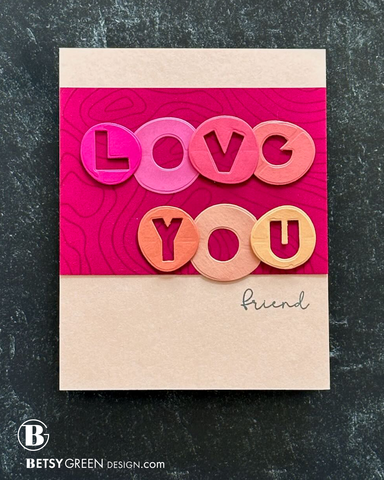
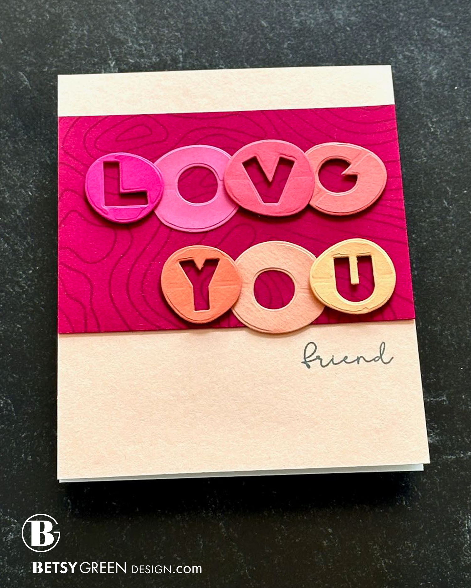
Another simple card, this one has a similar greeting to card 1, but the layout design and colors are different. This one uses a series of warm colors.
Again, I placed the greeting on a dark background, but this time I kept the background in the same warm color palette as the greeting. That is placed on a foundation of a card base that is an almost-neutral pale peachy color.
Not only is there variation in the color hues, but there is also variation in the fun design of these dies. The wonky circles are different for each letter or shape, so by spelling words, a playful rhythm is created.
Because I was using so much solid cardstock on this card, I brought in some pattern with a simple line-weight background stamp. (Stamped in embossing ink on the bright but dark background color).
For some fun dimensional variation, some of the letters are glued onto the background directly, and others are added with foam for dimension.
Colors:
cardstock: Concord & 9th Wildberry, Dragonfruit, Honeysuckle, Sorbet, Clementine, Grapefruit, Nectar, Buttercup.

Techniques:
This variation doesn’t use any of the letter circles. I pulled out all the hearts I cut out (while cutting the letters), and found a grouping that worked well.
I arranged the hearts in a rainbow order, but didn’t limit it to traditional core rainbow colors. I considered the balance of color values (how light or dark), and how each row and column looks, as well as the group as a whole.
Colors:
cardstock: Concord & 9th Dragonfruit, Honeysuckle, Grapefruit, Clementine, Sunflower, Parsley, Oceanside, Aqua Sky, Fig, and Mushroom.

Thank you for visiting!
Links are below if you’re interested in any of the products I used.
*Affiliate links do not cost you any more when you shop, but it is beneficial to creators when you use them, so thanks in advance!
