Two Takes on Winter with Block Printing Stamps
STAMPtember is here (catch the first live here if you missed it) and one of the products I got is the Christmas Block Art Stamp Set. Both of these cards use a similar cool color palette, and a similar asymmetrical placement of a trio of images, but incorporate some different details and techniques.


Techniques:
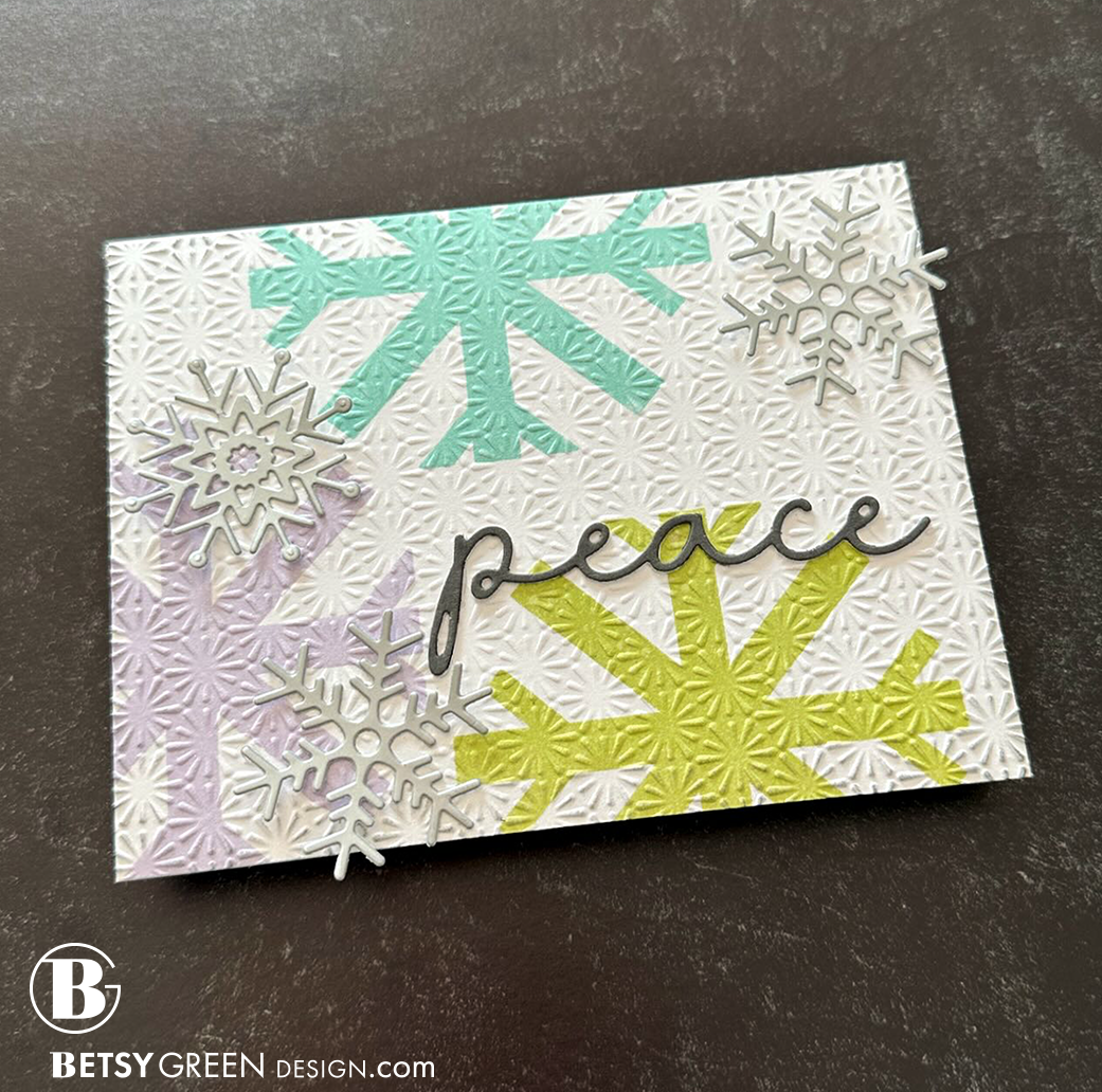
This card focuses on one element of the stamp set - the snowflake. I like the clean geometric style of this one. It is big and bold - which is an interesting contrast to how we typically think of snowflakes.
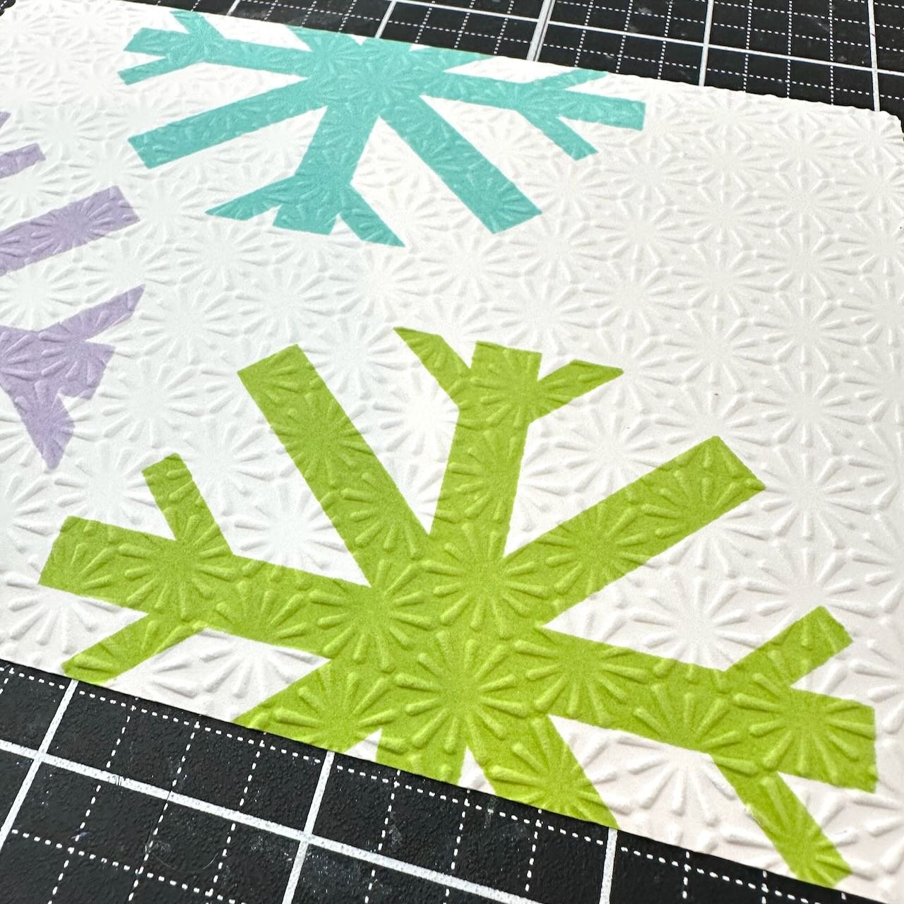
I started by stamping this in three colors from the cool range of the color spectrum. I made sure to pick three colors with similar value, which is what helps keep them balanced even though they are placed in an asymmetric (off-balanced) arrangement.
To add in some lighter detail, I ran that stamped piece through an embossing folder. The more smaller scale and more delicate feel of it has a good contrast to those big bold snowflakes, yet they still complement each other well because of the similarity in shape.
The word is die cut from Mushroom (charcoal gray) cardstock, and backed with a couple of white layers behind it. The white layers on the white background give this script greeting a bit of a floating, ethereal feel, which seems quite appropriate for a snowfall.
Some additional snowflakes in silver add a mid-level layer of interest. The silver ties in with the gray greeting, and they add that touch of shimmer that is always good with snow, yet it doesn’t distract from the bolder bright snowflakes.
I added a subtle touch of gray ink blending around the edges to add just a bit of depth and grounding.
Colors:
ink: Concord & 9th Sprout, Aqua Sky, Lilac, and Dove
cardstock: Concord & 9th Mushroom. Hammermill white. Matte Silver.

Techniques:
This card uses the three block shaped stamps. I thought that doing it with dye inks and allowing the colors to overlap could create a fun printing effect.
To relate the background to the card front and carry that block theme through, I trimmed the colors to align with some of the boundaries of the stamped blocks on the front.
A delicate sentiment has a lovely contrast to the bold block shapes. I tucked it into one of the open spaces. Stamping it in black gives it enough contrast to hold its own and not get lost in the midst of the big color blocks.
A sprinkling of black enamel dots create a flow through the layout and tie in that little touch of black through the design of the card.
Colors:
cardstock: Concord & 9th Sea Glass, Aqua Sky, Lilac. Hammermill White.
ink: Concord & 9th Sea Glass, Aqua Sky, Lilac. Versafine Onyx Black.

There are also dies and stencils available for this set, but I don’t have those. At least not yet. That will open up so many other possibilities too!
Thank you for visiting! Keep an eye out for more STAMPtember fun!
Links are below if you’re interested in any of the products I used.
*Affiliate links do not cost you any more when you shop, but it is beneficial to creators when you use them, so thanks in advance!

It began on September 1 with a huge new product release, and is an online celebration all month long. There are over 30 limited-edition collaborations with some of the wonderful companies who are part of this industry that will be coming too. You can find all the details on the Simon Says Stamp blog here.