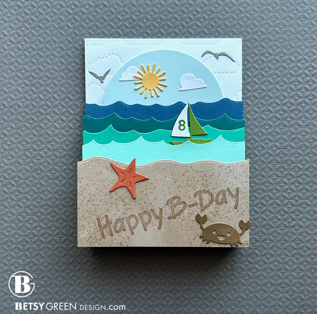
Scene Change Pop Up
I wanted to make an interactive card for a birthday. I decided to make one that has some good dimensional layers, as well as a spinning background that can be changed from day to night. This is a nephew of mine, and we have an annual family beach vacation together, so I knew he’d appreciate the theme.
I started this card with an idea for the layers of ocean wave, and doing something that had dimension. I also wanted to add in the fun touch of the spinner to change from day to night. This was for a kid who I knew would appreciate the details.
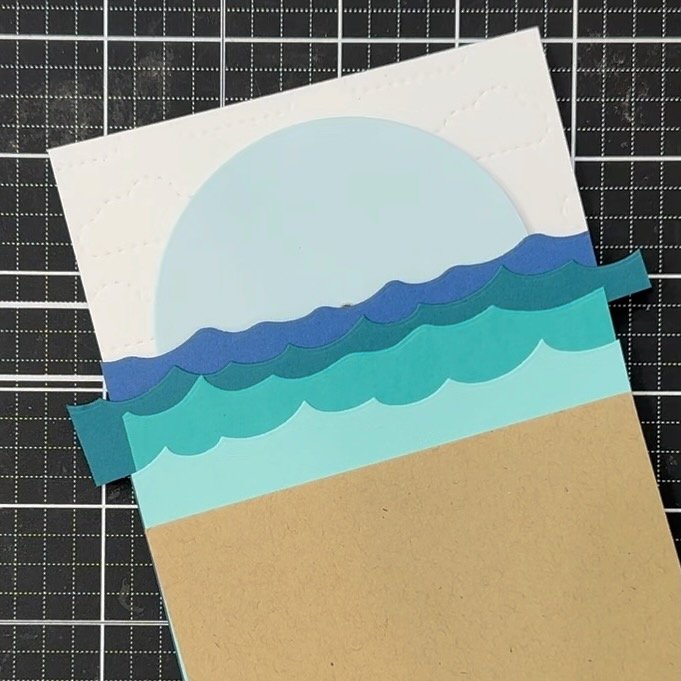
I started by creating the cloud-patterned background, and the tiers of waves with wavy edge dies and a quartet of cardstock colors that would mimic the look of the ocean, with deeper colors farther out.
Once I had the main scene part of the card together, I used an assortment of dies from my collection to add in the little elements. (See image at right.) All the sets are listed in my supply lists below.
I added a little personal touch by using some little stamps to stamp the sailboat with the number the birthday boy was turning.
The deepest/darkest water layer (Blueberry Concord & 9th cardstock) is applied to the background panel with foam tape around the sides and bottom to allow the spinning piece to rotate freely when moved.
The height of the wave layers was determined by how tall they needed to be to cover just over the center of the spinning piece, so the other half of the scene would be hidden.
The sand pattern was created by stamping the speckled stamp (from the Waffle Flower Inquisitive Seagulls stamps) with Versamark ink. It seemed a little bit too flat even after doing that, so I pounced on a bit of white pigment ink with a blending foam to add just a bit of visual texture and depth variation, which softened it up nicely.
Stamping the words on the sand with tone-on-tone ink (both cardstock and ink are Wheat, from Concord & 9th) gave it that “written in the sand” effect.
The layers do fold up so this card flattens enough to fit in an envelope!
cardstock colors: Spiced Cider, Buttercup, Parsley, Oceanside, Peacock, Aqua Sky, Powder, Midnight, Cobblestone, Wheat (all Concord & 9th)
ink: Concord & 9th Parsley and Wheat; Hero Arts Unicorn White; Versamark
When I make a card like this again, I’ll probably build out the dimension with pieces that are the color of the cardstock behind them, so they blend in better than the white in between the color layers. I also might make the dimensional layer blocks slightly less thick. While I love the dimension they add to the opened card, it is a lot and I think the same effect could be created with less depth.
I was told that the birthday boy liked the card, and even kept it by his bed right after he got it. If he’s happy, then my mission was accomplished.
Thank you for visiting! I hope you get some time to create something soon.
Links are below if you’re interested in any of the products I used.
Supply list*:
(Listed by company, with links to Simon Says Stamp and others. Simon Says Stamp links are affiliate links*.)
Items not included in the visual supply list (below) include:
Makin' Waves Long Border - Honey Cuts, Honey Bee Stamps
Little Letters Stamp Set, Concord & 9th
Perfect Matchbox Dies, Concord & 9th
Flying Gulls, Memory Box
*Affiliate links do not cost you any more when you shop, but it is beneficial to creators when you use them, so thanks in advance!


