Four Designs from one Stamp Set
February 2025 Release from Gina K Designs
Time for a new release from Gina! Once again, I’m excited to be a guest designer for the Gina K Designs release! These cards feature the new Second Chances stamp and die bundle.
To see the whole new release, take a look at this link here (at Simon Says Stamp) or here (at Gina K Designs).


Techniques:
I started with stamping the solid stamps for each of the three flowers. I used a light orange but blending in some pink and varied the coverage a bit for interest.
I finished the pattern by stamping the outline stamps for all three flowers all over the background. I did take care to vary the angle and mix them up so the different flowers are mixed around the card front.
I filled in some of the bigger spaces with little flowers from the Essential Greetings set.
The outline of the solid flowers is stamped in charcoal gray.
The stamped and embossed sentiment needed something to ground it, so I added a strip of Pebble cardstock (which matches the light warm grey that I stamped the little filler flowers with).
Colors:
(It would have been great to use Gina K Designs inks and cardstock for these cards, but so far I only have a few ink cubes of hers. I’m going to need to expand my collection! In the meantime, I used what I have.)
cardstock: Concord & 9th Tidepool, Pebble.
ink: Concord & 9th Grapefruit, Clementine, Tidepool, Pebble, Mushroom.


Techniques:
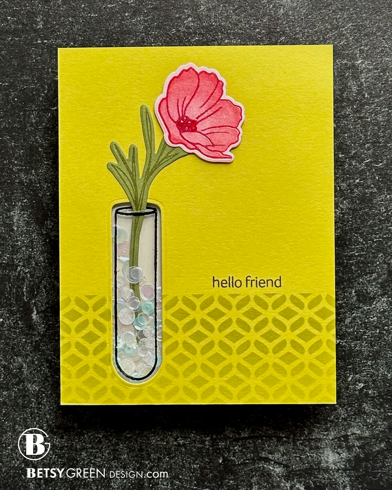
This card shows off the test tube vase in the set. I used both the stamp and die for it, and created a shaker for it.
I stamped on acetate to create the vase image, leaving 1/2”beyond the stamp so I had room to adhere it to the back of the cardstock.
I chose some saturated yellow-greens, and stamped the stems on that, and die cut those. (Tip: if you have a hard time getting long stamps lined up right for the die to cut well, I lay my die in position on my paper in the MISTI, then position the stamp on the die, and then pick up the stamp with the door of the MISTI. That’s when I remove the die and know I can ink and stamp and it will cut out right with the die.)
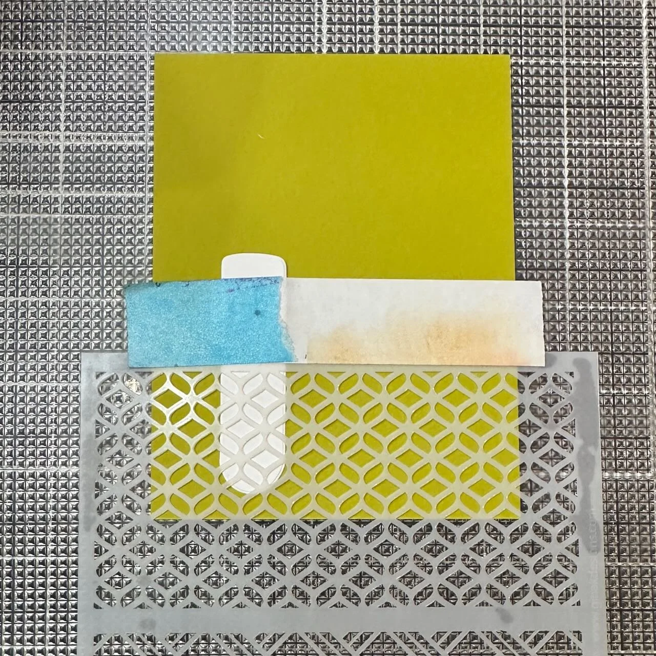
I chose a patterned stencil to create a bit of definition on this clean background. You can see in the pictures below that I masked off the vase before stenciling, because I hadn’t yet decided if I was going to do the shaker on this card or not. Since I die cut it out, there was no need to mask it off like I did, but you never know where the design inspiration will take you…
Once that was stenciled, I taped the acetate to the back side of the panel. I cut a slit where the opening would be so I could tuck a stem in. My goal was to mimic the visual effect of having the stem in a vase with water, but using sequins instead of water.
When stamping the flower, I used a blend of Peach Bellini and Passionate Pink on the solid stamp, and did the stamping on a soft pink cardstock. I repeated the stamping multiple times with different layers of color to create the color variation, and blended the edges of the inking on the stamp with a blending brush as needed so it would blend and not create harsh lines.
I did the outline stamping for the flower in Wildberry for contrast but to keep it within the same color family. After die cutting the bloom, I added a few drops of glossy accents in the center to add a little bit of shine and texture.
The flower is added to the top of the step with foam squares at the top, but glued at the base, so it would have dimension.


Colors:
cardstock: Concord & 9th Pink Lemonade, Lemongrass, Avocado, Artichoke, and Pebble.
ink: Gina K Peach Bellini and Passionate Pink. Concord & 9th Wildberry, Parsley, Grasshopper, Avocado. Versafine black.


Inspiration:
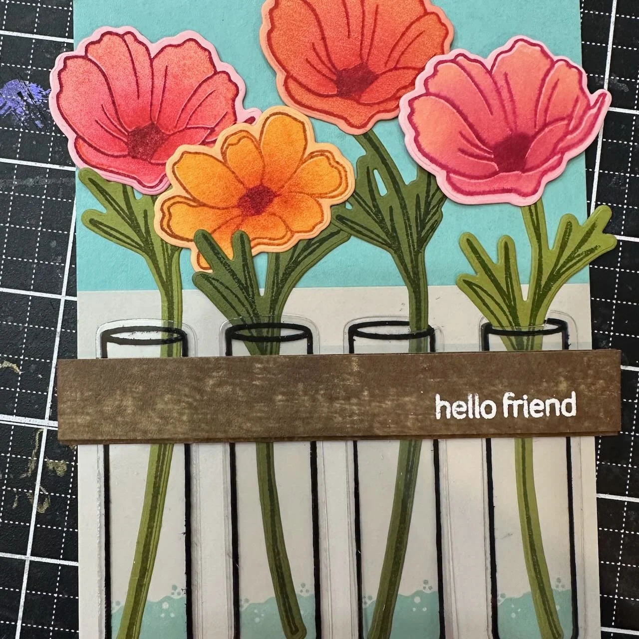
We have a wall mounted decorative shelf that has three test tube vases that hang from holes cut into the shelf. Ours happens to be black metal, but I’ve seen them in wood, also. That was my inspiration for this design, and the first thing I thought of when I saw the stamp set.
Techniques:
I stamped the test tube 4 times on some heat resistant acetate with black archival ink. I heat set it after, for good measure, and set them aside while I created the rest of the card elements to be sure the ink had a chance to dry before handing it too much.
I then stamped the same test tube four times (spaced out horizontally) across an A2 piece of light warm gray cardstock.
I found a piece of kraft colored scrap cardstock that was as wide as my A2 base, and gave it a rough wood look with two brown ink cubes. (see photo below.) I learned this technique from Gina, early in my stamping days during a Crop & Create Delivered Cardmaking virtual class.
After inking, I trimmed it into two strips that same size to be my shelves.
On one, I stamped and embossed a small greeting from the stamp set. (Be sure to use anti-static powder on this first, or the embossing powder will stick to all that inking that made it look like wood!)
The solid portion of flowers were all stamped using a blend of colors. I did this using my MISTI and lots of layers of colors, blending the ink on the stamp as needed with a blending brush before stamping to keep the edges of the blend soft.
I started each flower on a light colored cardstock in the same color family as I planned for the bloom.
Once the layers of solid stamping were complete, I added the outline stamping in a coordinating and much darker color.
The water in each vase is stamped directly on each of the vases on the cardstock - not on the acetate. I glued a stamped and die cut stem on top of each of the vases with “water”, and added a row of double stick tape across that - where I planned to put the wood shelf.
Next, I die cut each of the acetate test tubes, and layered one on each of the test tubes that were stamped on the cardstock. That double sided tape secures them well.
Another layer of double sided tape, and the first shelf was added on that. I lined the back of the other shelf layer with foam tape for dimension, and applied it on top, slightly shifted up so it really creates a sense of depth for the shelf. (You can see this in the larger photos.)
For the final touch, I added in all the blooms with a mix of liquid glue and foam squares, to create more natural looking position and depth.


Colors:
cardstock: Concord & 9th Pink Lemonade, Grapefruit, Creamsicle. Avocado, Artichoke, Tidepool, Pebble, Wheat.
ink: Gina K Designs Sandy Beach and Dark Chocolate. Concord & 9th Grasshopper, Avocado, Aqua Sky, and a broad range of assorted warm colors for the blooms. Ranger Archival Jet Black


Techniques:
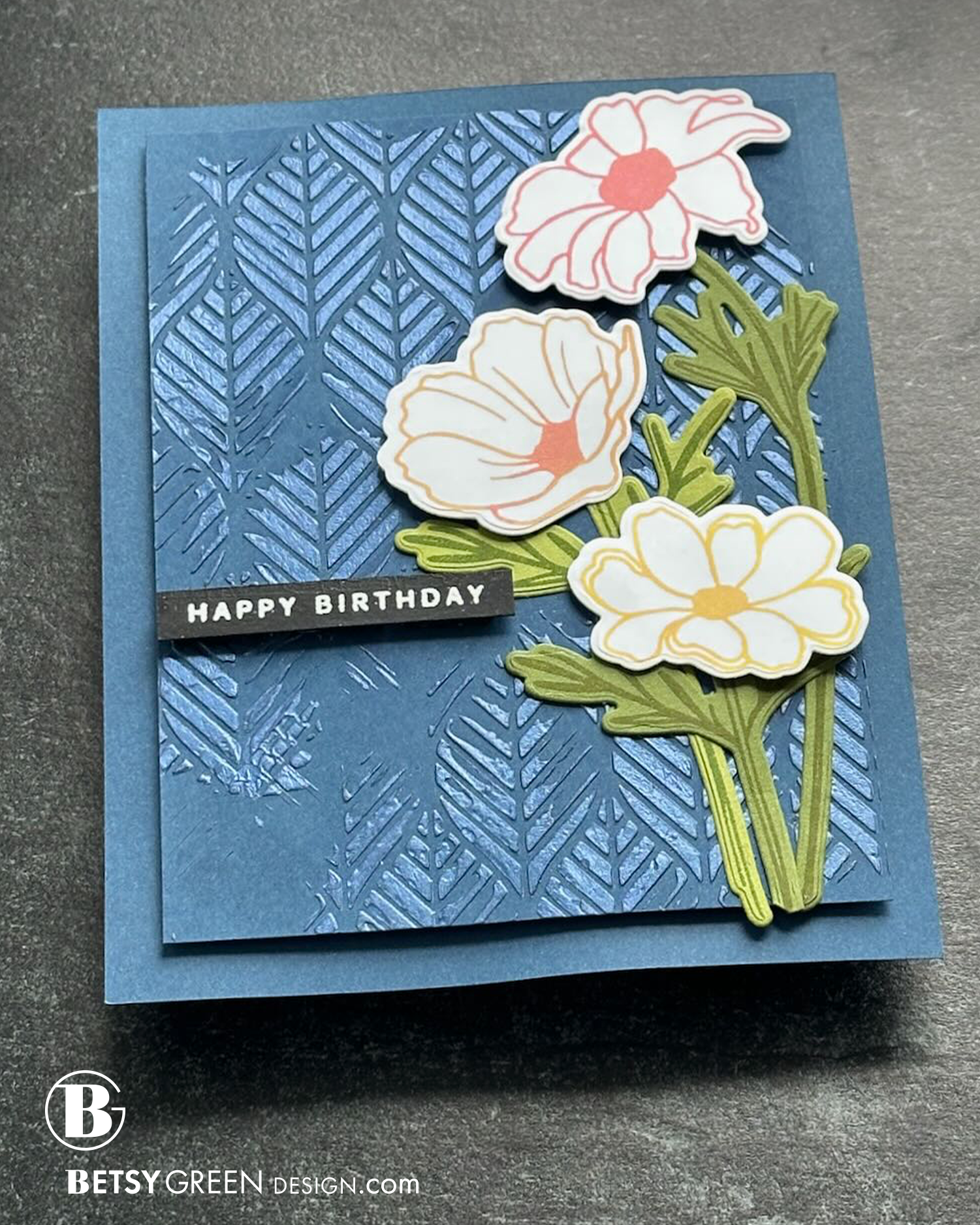
I stamped the flowers with outline only, in a group of three warm colors. (A warm pink, light orange, and a yellow.)
I stamped each flower in the solid color, and then layered in a second color from that group in the centers for some additional interest.
orange on the pink flower’s center
pink on the orange flower’s center
orange on the yellow flower’s center
These blooms needed the contrast from a dark background to really pop, so I chose a navy cardstock.
To balance out the simplicity of the blooms and the card layout I planned, I added some pattern and texture to the background.
I chose a stencil, and first ink blended on it with the same ink color as the background cardstock. I wanted a subtle effect.
Next, and keeping the stencil in the same position, I spread navy blue Lunar Paste through the stencil. This added shine and texture to the pattern. I spread it in an imperfect way, so there are spaces without it where the subtle ink blend shows through.
Keeping it all in the same color keeps it from being busy, and maintains that contrast with the light blooms that I wanted.
The repetition in the pattern of the stencil is a perfect background, and the smaller spaces and detail complements the simple style of the flowers well.
Colors:
cardstock: Concord & 9th Avocado, Artichoke, and Midnight.
ink: Gina K Designs Sandy Beach and Dark Chocolate. Concord & 9th Grasshopper, Avocado, Aqua Sky, and a broad range of assorted warm colors for the blooms. Ranger Archival Jet Black
Thank you for visiting! I hope you get some time to create something soon. Stay tuned for more over the next few weeks!
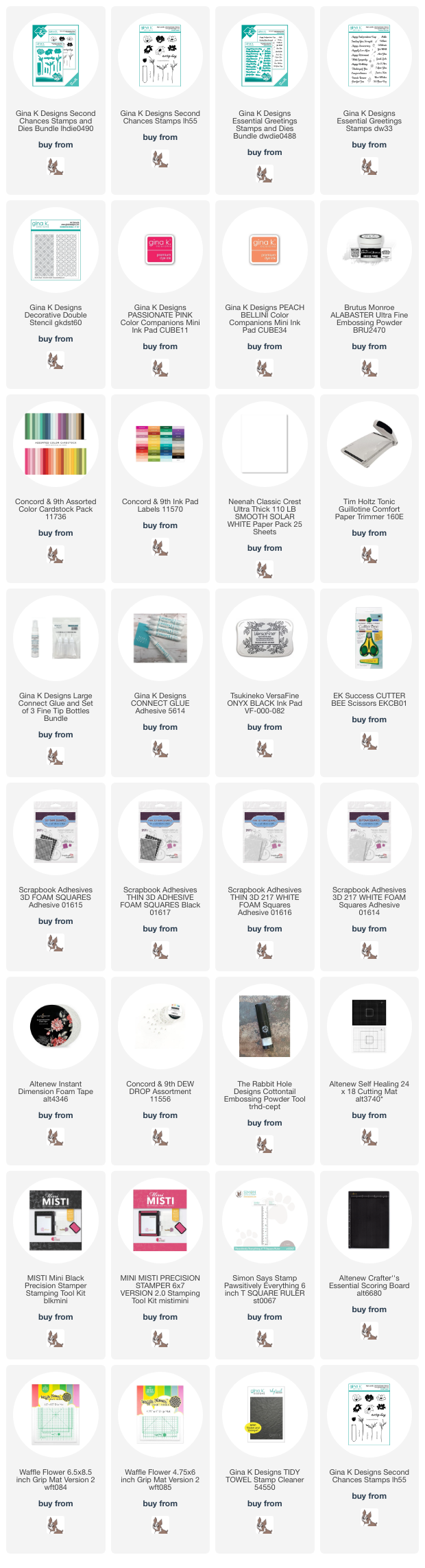
Links are below if you’re interested in any of the products I used.
*Affiliate links do not cost you any more when you shop, but it is beneficial to creators when you use them, so thanks in advance!