Funky Hearts in Many Ways
I’ve used this fun stencil set from Simon Says Stamp as is shown on the packaging, but the fun curvy shapes of the hearts gave me another idea also.


Techniques:
The curves on these make them look as if they are warped, especially when combined with the funky grid stencils in the set, but I think the varying sizes and curves also give them a sense of motion - like something flowing or floating, so I wanted to play with that.
To create a shape for them to flow, I wanted them to come to a wider shape from a more narrow section, like sun’s rays, but with curve. I was going to freehand draw this shape, but I thought people might be interested in another way to create it. (Especially if freehand drawing isn’t something you’re comfortable doing.) The Lava Lamp stencil pack has a great selection of stencils with curves! You can use them all together to create a fun swoopy striped pattern, but I just used one for this, choosing one that had curves like what I had in mind.
I placed the stencil on my card base cardstock and lightly traced two curves to create my shape.
Use a pencil, and keep the line very light so it is easy to erase. It doesn’t have to be perfect, but is just a guide for creating the flowing shape with our stencils. You can also just stencil for this without that, but sometimes those shapes take on a life of their own… ha!
I used just the two heart stencils from the pack, but instead of ink blending the whole stencil, I did them one at a time, trying to fit them in so they seemed like they were flowing through/from this shape.
Remember that you can use the stencil from either side, back or front, and rotate it to different angles as you go. It doesn’t matter for something like this. Just be sure to clean it off as you go!
I chose three colors to use for my hearts, but I also took care to vary my inking intensity as I blended, so some parts are more saturated than others.
This creates a sense of depth and movement, and also allowed me some variation if I placed two hearts in the same color next to each other, but making the second one darker or lighter than the first.
I also made sure to mix the heart colors as I went because I didn’t want to create an obvious pink-orange-green specific pattern. That would have been hard to do with these shapes also.
I started with the larger hearts that I wanted, trying fitting in some of the smaller or more “squished” ones along the way. Once I finished that, I had some spaces left that were larger than I wanted, so I used a different stencil set that has a mix of smaller hearts, and filled in with some of those.
The greeting is simply stamped in black, overlapping some of the hearts.
To create an additional layer of interest on this otherwise flat card, I filled in three of the hearts with a layer of clear “Frostbite” Astro Paste after ink blending them. That created a focal point triangle around my greeting.


Colors:
cardstock: Concord & 9th Carnation and Grapefruit. Hammermill White.
ink: Concord & 9th Sweet Pea, Grapefruit, and Lemongrass.


Techniques:
For this card I did the straightforward ink blending with the stencils, but I started with a light colored cardstock base. This means the space between the sections isn’t white, but a light blue.
I used both stencil layers for the grid, but only one of the two with the hearts, so every other space is just color without the heart.
To do the ink blending, I chose colors that were analogous to the cardstock color - just slightly more to the green-blue or blue sides on a color wheel..
Stacking the white die cut sentiment on a couple of Blueberry cardstock layers enhances the perception of dimension with a bit of forced shadow effect.
Colors:
cardstock: Concord & 9th Aqua Sky and Blueberry. Neenah White.
ink: Concord & 9th Tidepool, Oceanside, Blueberry, and Harbor.


Techniques:
I chose two color pairs for this version - all warm colors.
The squares were ink blended with the lighter of the colors from each pair. These stencils make it very easy to create an alternating pattern. For one stencil, I ink blended all the spaces yellow. For the other, they all were blending with the light pink.
The two heart stencils repeated that, but with the deeper/brighter color of the two pairs, so the brighter pink on the light pink spaces, and the Grapefruit on the yellow spaces.
For a big and bold sentiment, I cut the fun Love die in white, and backed it with a deep and bright pink shadow layer to create depth and contrast against the patterned background. The shapes of this word die seemed to mimic the funky curves of the stencils, so it seemed like a good match.


Colors:
cardstock: Concord & 9th Dragonfruit. Hammermill White. Neenah White.
ink: Concord & 9th Sweet Pea, Pink Lemonade, Grapefruit, Buttercup.


Techniques:
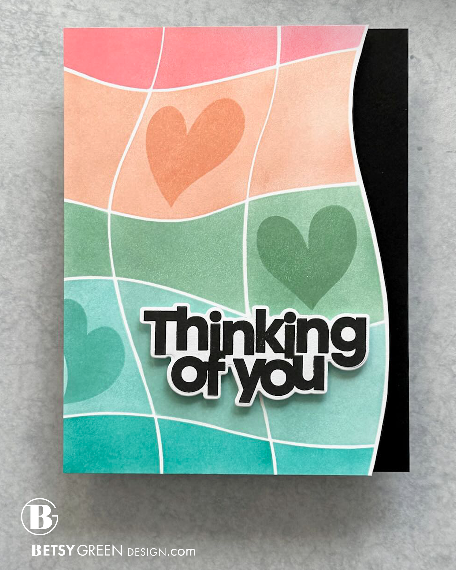
Instead of a checkerboard pattern, for this card I kept the colors in stripes. It involved some masking at the corners so I didn’t get the colors in the next row, but was easy to do since the checkerboard pattern minimized the connected spaces.
I also did a subtle variation in the blending from left to right, so the left side has a more saturated blend than the right. (That isn’t quite as clear in the pictures as it is in person.)
I also took care to avoid (and mask off where needed) the far right column of spaces. I planned to cut a curved edge and wanted to leave that space white.
I selectively added hearts in just a few panels, choosing three spaces (each in different rows and columns) and keeping in mind where I wanted to put a greeting. I did the hearts in a deeper version of the row color.
Once the ink blending was done, I used some good big scissors and cut off the right edge along the curve. I wanted to maintain that white border on the edge, to continue the pattern between the spaces, so kept that in mind as I cut.
I placed the cut panel on a side-folding A2 black card base. To create the edge, I traced the front curve on the black with a pencil, making sure that it was far enough in on the panel that the edge would be hidden by the front panel. (Tip: if you try this, be sure to keep the pencil away from the panel you’re tracing so you don’t get pencil lines on it. I just needed a loose guide of where to cut anyway.)


Colors:
ink: Concord & 9th Watermelon, Grapefruit, Eucalyptus, Tidepool, and Oceanside.


Thank you for visiting!
Stay tuned for more fun inspiration over the next few weeks.
Links are below if you’re interested in any of the products I used.
*Affiliate links do not cost you any more when you shop, but it is beneficial to creators when you use them, so thanks in advance!
