Ways to Use Color Pairs - and Birthday Balloons
Back from vacation, I finally got a chance to use the Bunch of Balloons series of products from my recent Concord & 9th order. I stenciled a few different backgrounds with the pair of smaller balloon stencils, and this is one of them.
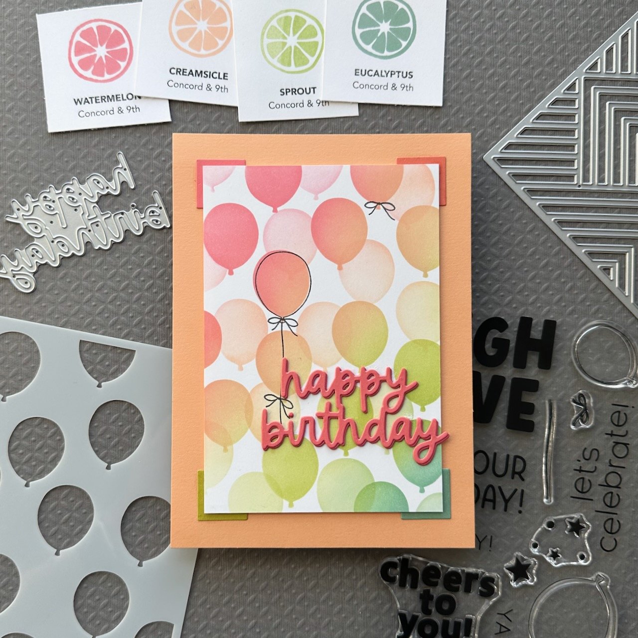
I made a bunch of balloon backgrounds with the stencils and a color palette I chose (Watermelon, Creamsicle, Sprout and Eucalyptus) that was made of of mostly new 2024 colors from Concord & 9th. This combination includes a pair of warm colors (Watermelon and Creamsicle) and a pair of cool colors (Sprout and Eucalyptus). For the first stencil of this background, I blended those four colors in rainbow order from top left to lower right.

For the second stencil, I used the same color blend that I used on the first one, but significantly lighter. This adds a sense of depth and helps those seem more in the background. I trimmed the panel down to give me a nice wide border of Clementine to show that off. (I layered a few other scraps of cardstock behind it to provide some dimension off the back panel. Clementine is my favorite color from their 2024 color release!
Although I really liked the clean look of the balloon panel on the card front, I felt it needed a little something. I used the Empire Inlay Card Front Die to cut some scrap pieces of Watermelon, Sorbet, Grasshopper, and Eucalyptus so I could use one of the pieces to act as a corner detail. I tucked them under the four corners, coordinated with the color blend from the stenciled balloons. These help frame the balloon background that is the star of this card. It has a bit of a photo corner effect, like from the old scrapbooks or photo albums, don’t you think?
The coordinating clear stamp set incudes outlines for the balloons, and a bow and string, which are really cute touches. I chose a focal point balloon and stamped those, offsetting the balloon outline just a bit.
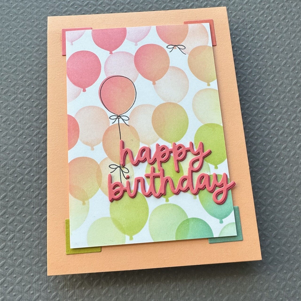

I used a the Everyday Expressions Die Set to cut out the happy birthday. I cut it twice from Watermelon and once from Honeysuckle to give it a bit of depth and a faux shadow.
To further play up the color pairs, and provide an extra detail of interest, I layered the two colors slightly offset.
After gluing that onto the card, I decided to add two more bows to help with visual flow. (One is tucked in by the bottom of the “h” in “happy”, as if the string is tied onto the word.)
Some design principles used in this card include:
Repetition: In the balloon stencil, as well as in the offset elements you see with the corners, the balloon outline stamp, and the greeting.
Emphasis: The stamped balloon outline and the bright bold greeting are some examples of this.
You can find more in this card, but I’m going to try to start pointing out a couple in each card for those of you who want to learn more.
That’s it for this one! Thank you for visiting. I hope you get some time to create something soon.
Links are below if you’re interested in any of the products I used.
Supply list*:
(Listed by company, with links to Simon Says Stamp)
Concord & 9th -
Bunch of Balloons Stencil Pack
Bunch of Balloons Clear Stamp Set
Empire Inlay Card Front Die
Everyday Expressions Dies
Ink: Watermelon, Creamsicle, Sprout, Eucalyptus, Mushroom
cardstock: Watermelon, Honeysuckle, Sorbet, Clementine, Grasshopper, Sprout, Eucalyptus, , White
Gina K Designs -
The Ink Stand - Rectangle Ink Stand
Tsukineko - VersaFine Onyx Black Ink Pad
Waffle Flower - Grip Mat
*Affiliate links have been used with no cost difference for you.