Colorblocked Pattern
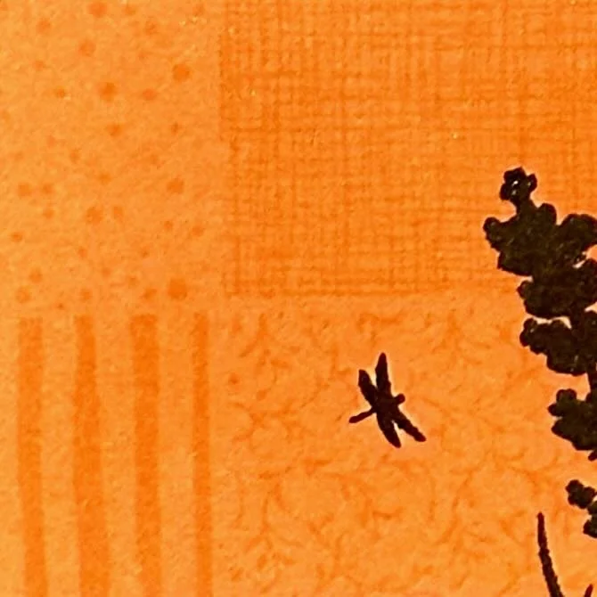
There was a background stamp in the Gina K Designs October release that has four smaller squares of patterns making up the big square of the stamp. (See it here.) I was intrigued to see some discussion about people wanting to cut it apart to have the patterns isolated.
I actually think it is great to have this four-in-one background stamp, and though I’ve used it on cards already (you can see some on this post), I wanted to try something different that would play with those patterns more.
Approach:
I was intrigued to see some discussion about people wanting to cut it apart to have the patterns isolated. I really like the possibilities of this four-in-one background stamp, and though I’ve used it on cards already (you can see some on this post), I wanted to try something different that would play with those patterns more.
Techniques:
I chose my color palette of these 4 autumn-feeling colors, and stamped the Beautiful Patterns background stamp on each color. I used a combination of watermark ink and sometimes added a lighter version of the color (a peach on the orange paper, for example) if the watermark ink wasn’t showing up enough.
I wanted to see the pattern, but wanted it to remain subtle. I knew that with my plan to color block those colors with the pattern, doing it high contrast would get too busy. (But would be fun to do in a different design!)
After the stamping, I trimmed down each color into a strip so I could fit three vertically on my card. I made sure to do the trimming on the edges, so the center point of all four patterns (shown in the detail image) was included for each of those 3 main colors.
Once I’d trimmed those and added them to my card front, I stamped the images (in black) and the sentiment (with gold embossing). I also added a bit of clear embossing ink to the black bird that I added. I was able to do that by stamping the other black images first, and heat setting them. I used anit-static powder on that before stamping the bird.
The flowers were created by using a couple of ink cube colors on the stamp. I used an embossing ink pen to add dots to the centers that I embossed with the same gold as the sentiment.
Colors:
cardstock: Concord & 9th Cayenne, Spiced Cider, Stardust, and Peacock.
ink: Concord & 9th Cayenne, Spiced Cider, and Honeycomb. Gina K Obsidian. Versamark.
Thank you for visiting! I hope you get some time to create something soon.
Links are below if you’re interested in any of the products I used.
*Affiliate links do not cost you any more when you shop, but it is beneficial to creators when you use them, so thanks in advance!


