Beautiful Bundle
Sharing a sampling of cards featuring the Gina K Designs October Release
I recently did the Crop & Create Cardmaking event from Scrapbook and Cards Today. It turns out that the products we used for the Gina K class are part of the new release, so I have a few cards to share with this versatile set.
Approach:
I wanted to create a simple layout with an ink blended oval, but Gina has already shared one with a centered layout, so this features an asymmetric version. Ink blending through a stencil shape is so easy, and can add a lot of interest to a card.
Techniques:
Stamping both parts of this iris stamp in black created a bold and modern element. Because the ink blended oval was offset to the left, I shifted this to the right for visual balance. I made sure to overlap it onto the oval, which grounds it in the composition.
A bold sans-serif greeting fit the style and mood of the card. I tucked it in with the oval and flower image, so the three together create a strong focal point.
A few enamel dots in the lighter of the two colors I used for the blend (Lemongrass) creates a visual flow through the layout, and provides some connection between that focal point and the white space.
This is a standard A2 size card, but in order to add an additional bit of color interest to the front, and enhance the modern style, I folded a card base using cardstock to match the deep color of the blend (Tidepool). I cut 1/4” off the right side of the front panel, so the stripe of blue from the card base shows. This also creates additional interest for this mostly flat card, by taking it beyond a single plane and showing the additional layer behind the front.
Colors:
cardstock: Concord & 9th Tidepool. Neenah.
ink: Concord & 9th Lemongrass & Tidepool. Versafine Onyx Black.
These cards also feature the oval stencil along with silhouette stamping, but these used single colors in each oval. Varying the intensity of the blending creates good interest with only one color. Allowing the colors to overlap brings a kind of visual color magic that never gets old.
Room for improvement: If I did this card with three stacked ovals again, I’d do a lighter blend on the pink oval. It ended up being too heavy and out of balance with the other two.
This next card features a top panel filled with four overlapping single color ovals. (If you do this, placing your colors in sequence like you’d find on a color wheel minimizes the chances of ending up with a muddy brown when complimentary colors overlap.)
By stamping the flowers on the top panel in black but the bottom layer flowers in a lighter gray, it strengthens the focal point and adds that depth and additional layer that give the card more interest.
Coming soon!
The idea is just waiting for me to take some time to create it, but it will be here in the next day or two.
These new Beautiful Day and Beautiful Patterns products were in our class kit for the recent Crop & Create Cardmaking event, so I got a chance to use them before the release. The class included three cards. I made some color and design variations to make them my own.
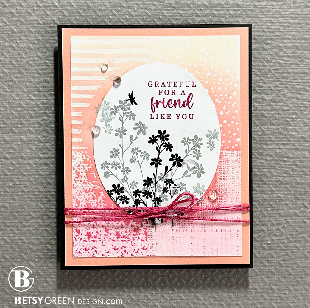
Here’s a card to show that not everything works out. I had to try, but it is a lot more going on and a lot less precise that my design style is. Sharing it here, because I think some of the techniques are good, and I know the style may be of interest to others.
I think the process of creating and experimenting is ALWAYS worthwhile, no matter the outcome. That’s really why many of us create, right?
Thank you for visiting! I hope you get some time to create something soon.
Links are below if you’re interested in any of the products I used.
*Affiliate links do not cost you any more when you shop, but it is beneficial to creators when you use them, so thanks in advance!


