Creative Ways to Use Tree Dies
Today I have a couple more cards using a different product set from Simon Says Stamp’s new Cheering for You release. You can see the whole release here.
I got this Geo-me-Trees set from a thoughtful friend, and though I immediately thought how great it would be for autumn or holiday trees, I wanted to see what else I could do with it.


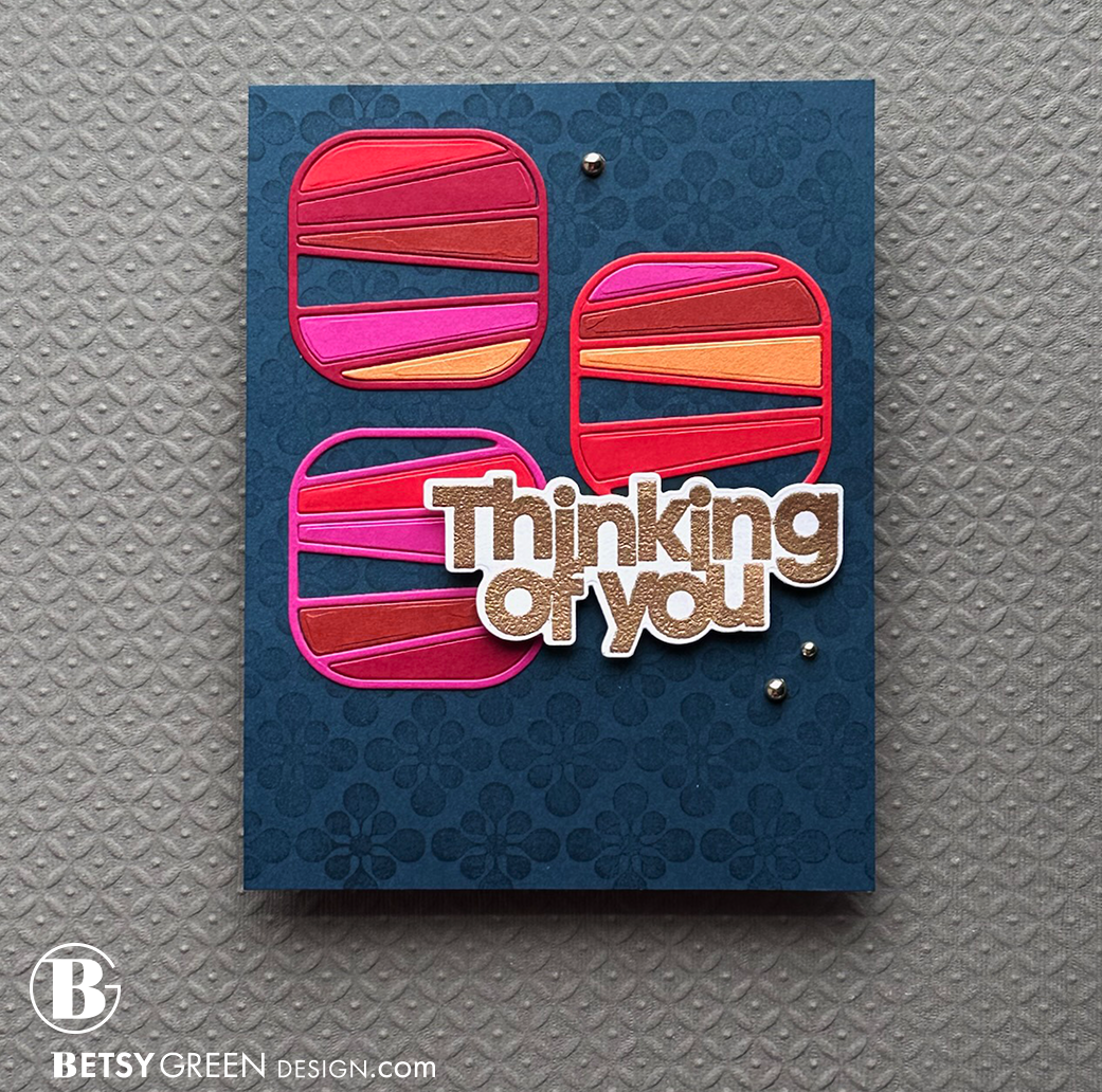
The die set for Geo-me-Trees creates fun lines that create great spaces that can be filled or left open. These will make really fun shaker cards, and that is on my list for future ideas. I went with more a more straight die cutting approach to start, just to get to know the shapes and spaces they create.
Techniques:
Die cut the striped square shape out of five colors of cardstock so I could mix and match the pieces.
Each of the three squares on the card includes one strip that matches the outline color, and at least one section left open to allow the background to show through. I like the instead of coloring them in on white puts the focus on the linework itself.
Because my square elements are bold in both shape and contrast, I wanted a sentiment with a simple shape and that also was bold enough to balance with it. A fine script would have gotten lost. The embossed gold color adds a layer of interest with the subtle shine, and coordinates well with the warm color palette in the squares.
Colors:
cardstock: Concord & 9th Dragonfruit, Cranberry, Poppy, Cayenne, Clementine, and Midnight.
ink: Versamark embossing ink.
Some design principles applied in this card include:
Rhythm: There is a rhythm created in spacing, colors, and in patterns on this card. Rhythm in design is a lot like staccato movement (if music is familiar to you), or pattern. Think stepping stones, but with some balance and interplay. You can see this in the negative spaces in the squares where the blue shows through, and hops from side to side in those various shaped spaces. There is also a rhythm in the squares themselves, with different colored and shaped strips, and in the background (which is a more subtle background rhythm), and it is all punctuated with those pops of gold.
Contrast: The bright warm squares against the dark cool background color. White background on the sentiment that allows it to pop against that dark background.
Proximity: This can be generally thought of as grouping; giving elements meaning (importance) when they are together. This can create a focal point, or simply help the layout feel cohesive and keep parts from appearing to float off on their own. (The principle of White Space is also closely related to this. By considering proximity in the placement of the sentiment and the gems, white space is created around the main grouping of elements, which adds focus to the elements, and keeps the layout from being busy or cluttered, even with multiple elements at play.
You can find more at work in this card, but I’m trying to point out a couple in each post for those of you who want to learn more about design.

A tall slim triangle often makes me think of abstract & geometric evergreen trees. When you consider it as a shape, you can use it to create a geometric pattern, use it to create a circle-type shape like a snowflake or wreath, or fit the shapes together like a puzzle to create any sort of pattern.
That’s what I did with this one. I wanted to create a sense of flow with these geometric shapes (because I always appreciate a good challenge). My original plan was to do it so it ran from top to bottom of a vertical card, but - as creative projects often do - this one morphed and evolved into what you see here.
Colors:
cardstock: Concord & 9th Mushroom.
ink: Concord & 9th Pink Lemonade, Grapefruit, Buttercup, Avocado, Tidepool, Harbor


I’d used the squares and triangles, but didn’t want to leave the circles out. I have ideas, I just hadn’t gotten to them yet. There is really so much you can do with these products! Here’s a quick one that uses the circle tree die.
Techniques:
I pulled some scraps of a series of analogous colors (colors adjacent on the color wheel), a range of green-blues to purples, and cut the same circle die out of each of those. I made sure to have a range of lighter and darker values.
You can see in the photo below that I wanted a color of blue cardstock that was in between the colors I had, so I blended a couple of ink colors on white cardstock to create the “slightly lighter than Blueberry” blue that I wanted.
I left a few matching “centers” in each of the circles, but also added one in each of an adjacent (following, mostly) color.
Variation in the rotation of the circles adds a lot of movement to the card, which fits with the kind of flow I intended. A sprinkle of a few of the smaller centers outside of the circles adds to that energy, as does the way some of the circles flow beyond the bounds of the card panel.
Colors:
cardstock: Concord & 9th Juniper, Oceanside, Aqua Sky, Blueberry, Powder, Fig, and Lilac.
ink: Concord & 9th Harbor & Blueberry, Versamark embossing ink.


Thank you for visiting! Take some time to check out this new release if you have a chance.
I hope you get some time to create something soon.
Links are below if you’re interested in any of the products I used.

*Affiliate links do not cost you any more when you shop, but it is beneficial to creators when you use them, so thanks in advance!