Groovy Notes - Celebrate
Simon Says Stamp has a brand new release! Celebrate is available now for shopping, and has a really good mix of product! It includes lots of later spring occasions - teacher appreciation, graduation, Mother’s and Father’s Days, some good birthday products, and lots of other fun things… like tacos! Be sure to take a look.
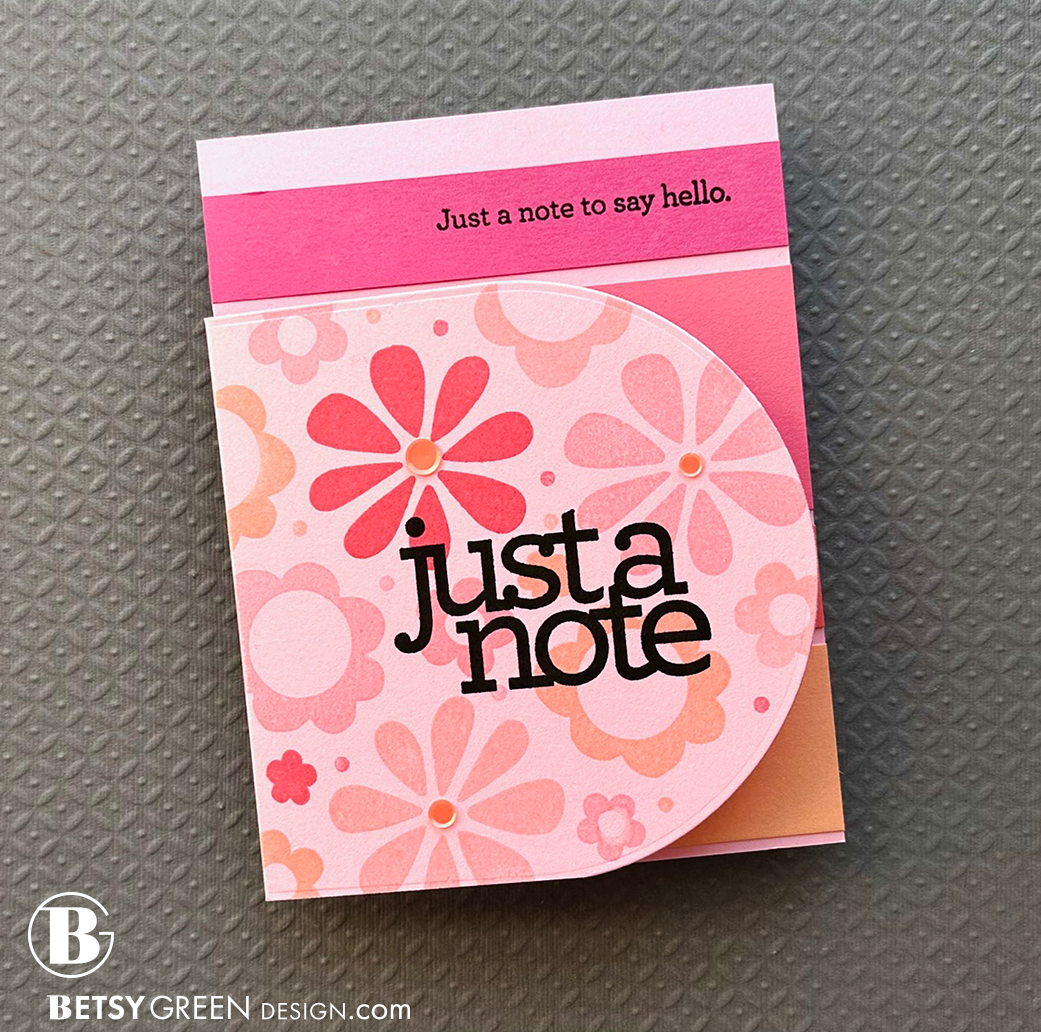
This card - and the next couple of posts - feature the Just a Note Notes stamp set, which is a Simon Says Stamp and CZ Design collaboration. (Those are some of my favorites!)
For this one, I chose four good friendship-type messages. I chose a palette of these warm, cheerful colors and decided to do them in stripes. This grounds the greetings, and I varied the height of them to fit the greetings that I put on them. You can see in the image below that I planned it out with the clean, loose stamps before I actually stamped them on the pieces.

For this one, I chose four good friendship-type messages. I chose a palette of these warm, cheerful colors and decided to do them in stripes. This grounds the greetings, and I varied the height of them to fit the greetings that I put on them. You can see in the image here that I planned it out with the clean, loose stamps before I actually stamped them on the pieces.
I like to create and send cards that offer more when they are opened. A little extra, whether it is an involved interactive feature, or a basic fold and reveal, it all makes the card - and recipient - feel more special.

I made sure the stripes would peek out from behind the front, and chose an arched die to cut the front of the card. The rounded arch allows both a good peek of the stripes and a nice contrast with the straight cardstock stripes inside.
I added some fun to the front with the Flower Happy Stamps, in colors to coordinate with the cardstock stripes inside. I added a little stamp inside as well, to tie it in, and some color-coordinated sequins in the centers of a few.


Some design principles used in this card include:
Repetition: You can see this in the shapes - the curved arch of the front panel, the shapes of the letterforms, and the rounded flowers. The consistency of colors from the stamped flowers to cardstock stripe colors also fits here.
Contrast: There is contrast between the black stamped greeting and the softer colors of the flowers and pink cardstock background. That pop you notice? That’s contrast.
Emphasis: This is also along the lines of hierarchy and focus. What stands out? What do you see first? (and where do you go next?) Usually on a card, the main sentiment is where you want the emphasis, but sometimes it is a really amazing image. In this case, the combination of the bold black “just a note” and the pattern background give that front panel emphasis even though the inside panel is what shows at the top of the card.
You can find more in this card, but I’m going to try to start pointing out a couple in each card for those of you who want to learn more.
Thank you for visiting! I hope you get some time to create something soon.
And go check out this new Celebrate release at Simon Says Stamp! Here’s a link to make it easy.
Links are below if you’re interested in any of the products I used.
Supply list*:
(Listed by company, with links to Simon Says Stamp)
Concord & 9th -
cardstock: Pink Lemonade, Honeysuckle, Watermelon, Sorbet, Creamsicle
Ink: Ballet Slipper, Pink Lemonade, Watermelon, Nectar
Gina K Designs - Connect glue
Simon Says Stamp -
Just a Note Notes Stamp Set
Flower Happy Stamp Set
Nested Domed Arches Wafer Dies
Tropical Sequins
Tsukineko - VersaFine Onyx Black Ink Pad
*Affiliate links have been used with no cost difference for you.
