Creating Two Cards from One Focal Element
When I first opened this Altenew set (borrowed from a kind crafty friend) I jumped right in and started stamping, embossing and stenciling the great orange blossom element. I used a different set of colors on each, and tried to mix up some details and techniques with them, so I’d end up with three different styled cards.
Well, as usual, I didn’t stop at three. I was limited by time, but still ended up with more. So many possibilities! (There will be a second post coming soon.) And the surprise was that with one of those main focal elements of the oranges and foliage – I decided to cut one into two pieces! (I’ll admit, I did pause and consider before I stuck it in my paper trimmer, but it is only paper… and time… so why not.)


Why cut it?
Part of the reason I decided to cut it, was because I did this one without the stamping. I am happy with the colors I chose, but it has a softer look without those crisp lines to define it. I wanted to pair it with a patterned background, but didn’t want to cover that up completely.
The other reason, was that the first card I made (see below) already used the full element, and I like to push the limits more and do different things when I make multiple cards with a set. Even with different colors and patterns, I didn’t want it to be too much the same.

Techniques:
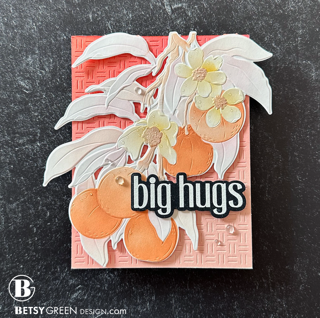
For this card I wanted to focus on the oranges. I planned to leave the leaves white, and add color to the oranges and blossoms only, but decided it was too plain. I did go in and add some very light pink and orange to the leaves with the stencils and my blending brushes.

The front of this one is the die cut. Two layers of 110lb Neenah paper. That allows the fun basketweave pattern to show, and allows for great natural shadows behind the die cut front.
The inside panel is Nectar cardstock, cut with a cover die. I ink blended Watermelon ink on it, and added a little bit of Creamsicle from the top left corner to bring in the orange.
I added two circles inside behind the die cut for writing. (I can also write on the back of the card if I want more space.)
For the flower centers I added Solar Paste through the stencil instead of blending ink. I tapped the wet paste with the palette knife to give it texture that more closely mimics the pattern of the flower.
Colors:
cardstock: Concord & 9th Nectar, Neenah 110lb Solar White, Hero Arts Black.
ink: Concord & 9th Ballet Slipper, Watermelon, Nectar, Creamsicle, Clementine, Buttercup.


Now, onto the two cards from one element.
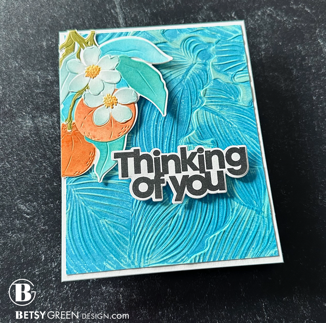
I embossed the Tangerine Grove element, and then did a pretty straightforward ink blending through the layering stencils for it. I went deeper with colors than the first card, but not totally saturated.
I realized that I might not want the whole thing on the background, and that got me thinking.

Techniques:
I strategically cut the tangerine element in two pieces, making sure first that each piece would work on the cards I was planning.
This background is embossed, with Blueberry ink added in the embossing folder while I embossed it. I later came in and ink blended the lighter Aqua Sky ink over that.
Using a bold and high contrast sentiment helps that stand out from the organic lines and shapes of the background and tangerine element.
Colors:
cardstock: white
ink: Concord & 9th Clementine, Spiced Cider, Buttercup, Artichoke, Tidepool, Aqua Sky, Blueberry, and Harbor


Techniques:
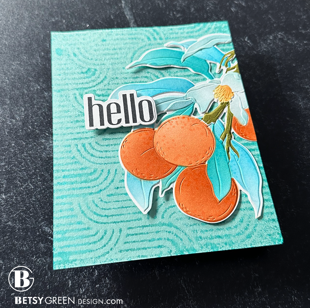
This card uses the second piece of that tangerine element.
For the background pattern, I used Simon Hurley’s Stamping Foam on an embossing folder. (both linked below in the supplies). I inked up the Stamping Foam (a while ago actually, I keep using it) with teal ink, spritzed it with water, and pressed that on my cardstock panel like a stamp to make that print. (I did this in the corner of my Misti because I wanted to keep the lines of the “stamp” parallel to the top and bottom of the cardstock panel. I love the soft “fuzzy” pattern for a background like this. It is added interest, but doesn’t take away from the focal element.
I just had to use a sentiment from the Altenew Sulfur Cosmos Build-A-Garden set. The lines and shapes of it match up so well with this Linked Ovals background pattern.
Colors:
cardstock: Concord & 9th Juniper, Oceanside, Aqua Sky, Blueberry, Powder, Fig, and Lilac.
ink: Concord & 9th Harbor & Blueberry, Versamark embossing ink.

DESIGN PRINCIPLES
Some design principles applied in this card include:
Asymmetry: You’ll find asymmetry in almost all of my cards. I like the less assumed, less centered style and energy. Card 1 is pretty symmetrical in terms of element placement. It does display asymmetry in the balance between the bold sentiment in the lower right and the deeper, more intense colored blending in the upper left corner. Cards 2 and 3 are much more asymmetrical, with the partial element used off to one side. For Asymmetry to work (in most cases) and not feel off, the weight of one element needs to be balanced with something on the other side - whether it is color, white space, a sentiment, etc.
Pattern: Cards 2 & 3 both work well with the background patterns because the focal element is softer and not high contrast. If I’d stamped the outline in black on that element, these patterns would not be as successful because the patterns of the element and background would be competing, and they are all too similar in scale and style. To mix patterns well, you need variation in scale (sizes, such as a large with a small) or shape (something organic like a flower with something more clean and geometric like stripes), for example.
Repetition: The lines and ovals of the background pattern and sentiment typography on Card 3 are such a perfect match for each other in terms of geometry. They share an Art Deco style. But in order for it to work well, they needed a little bit of contrast. Running the background horizontally, in comparison to the vertical orientation of the lettering, offers up just the right amount of contrast.
Contrast also shows up in the crisp black and white sentiment, against the background of leaves and card base that are so similar in color and value. (Value is how light or dark it is. If you take a photo on your phone and convert it to black and white, the concept of value becomes more easy to see and understand.)
You can find more at work in this card, but I’m trying to point out some in each post for those of you who want to learn more about design.
Thank you for visiting! I hope you get some time to create something soon.
Links are below if you’re interested in any of the products I used.
*Affiliate links do not cost you any more when you shop, but it is beneficial to creators when you use them, so thanks in advance!