One Stamp, Three Ways
Today I have a trio of cards using a stamp from Simon Says Stamp’s Cheering for You release. (You can see the whole release here.) I wanted to try a few different approaches with this Just Write stamp. I know this barely scratches the surface of what I can do with it, but it is always fun to find a variety of uses for our products.
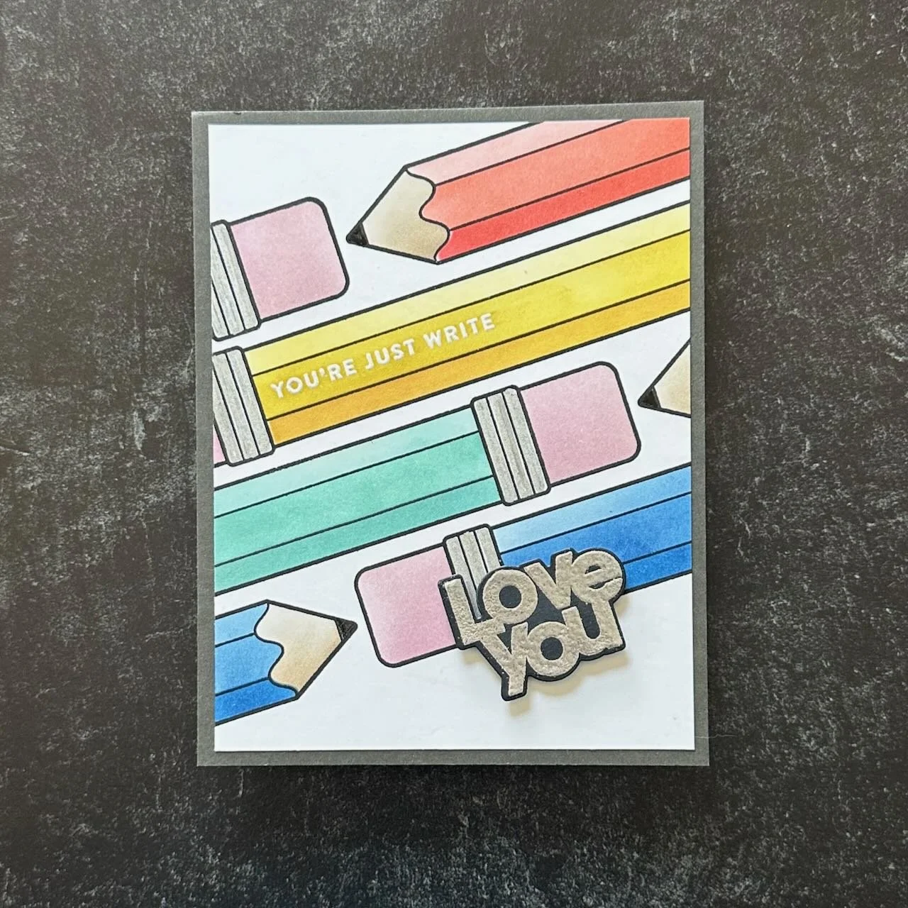


This uses the main card front stamp and the stencil. I stamped the main stamp on an angle for a dynamic variation from the generally assumed way to use it.
Techniques:
I really appreciate that the stencil is made in a way that allows for shading that adds dimension. You can do this with light, medium and dark shades for the three layers of the pencil sides, but I challenge myself (and my ink blending skill) to do all three shades with one color, by adjusting both the amount of ink and pressure I used to apply it. (Note: I did use two inks for the yellow to achieve the light and darks that I wanted.)
My original intention was to use silver paste for the crimped metal part that holds on the eraser top, but that stencil was missing! So, for my backup plan I used a silver metallic marker to color those in.
The lead tips are colored in with a black glaze pen, for the little touch of shine.
I honestly think that the thing that made me most happy about this card was adding the secondary message on the yellow pencil and embossing it. It reminds me so much of the pencils I used to collect when I was a kid that had the fun toppers and stamped messages on the side like that.
Colors:
cardstock: Concord & 9th Mushroom, Neenah white.
ink: Concord & 9th Carnation, Ballet Slipper, Sorbet, Sunflower, Buttercup, Tidepool, Blueberry. Gina K Sandy Beach. Versamark embossing ink.
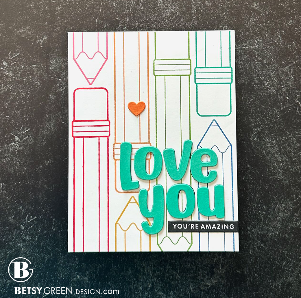
For this one, I wanted to let the lines shine, so I did the stamp but not the stencil.
Techniques:
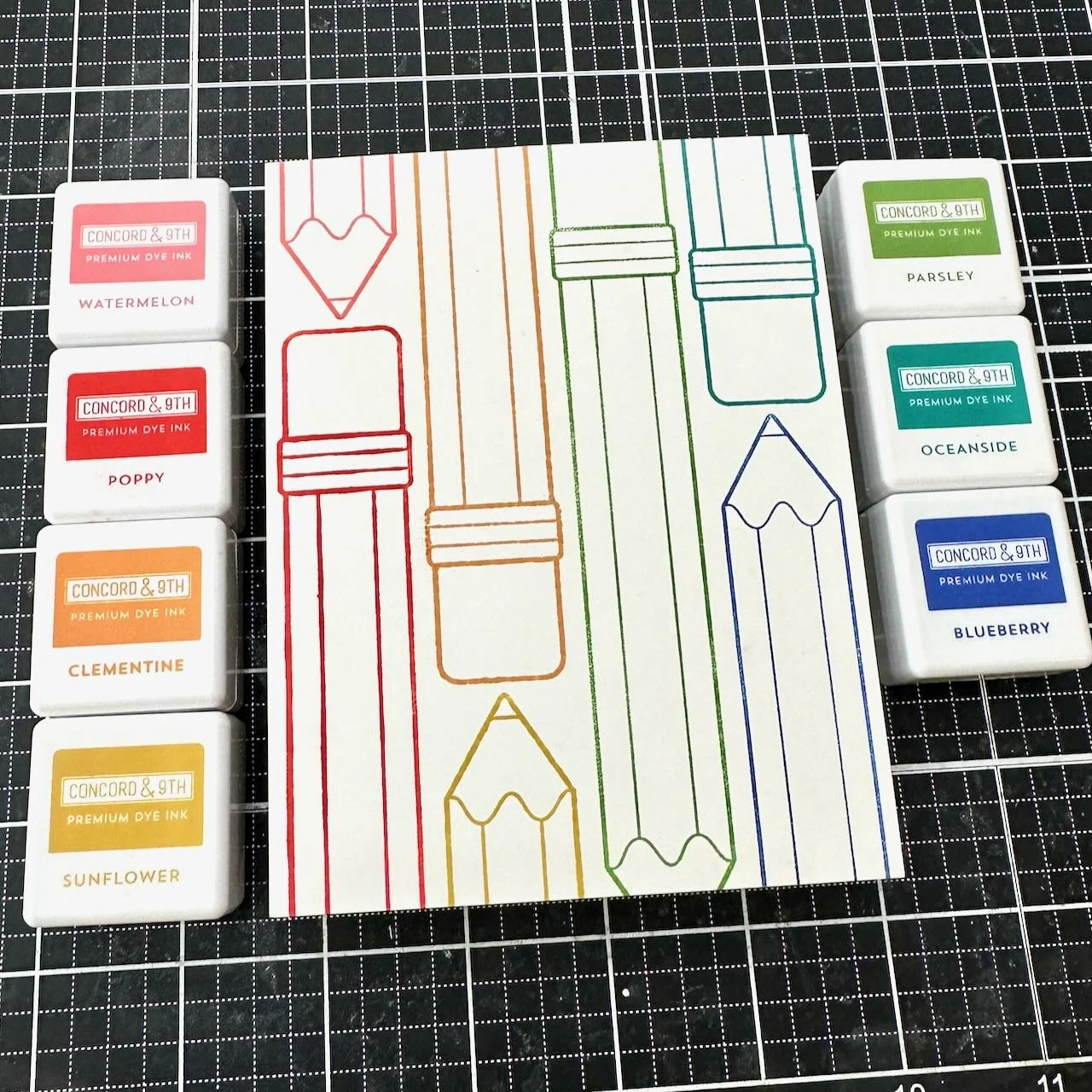
I inked and stamped the pencils one at a time so I could do them each in a different color. It is a rainbow, from top left to the lower right corner.
To help the greeting stand out, I cut it out of four layers - two black, two teal (Oceanside). The black grounds it on the busy background and helps add perceived shadow that lets the bright letters stand out more. The white on black secondary sentiment helps ground that main one.
Colors:
cardstock: Concord & 9th Clementine and Oceanside. Neenah white. Hero Arts black.
ink: Concord & 9th Pink Watermelon, Poppy, Pink Lemonade, Sunflower, Parsley, Oceanside, and Blueberry.

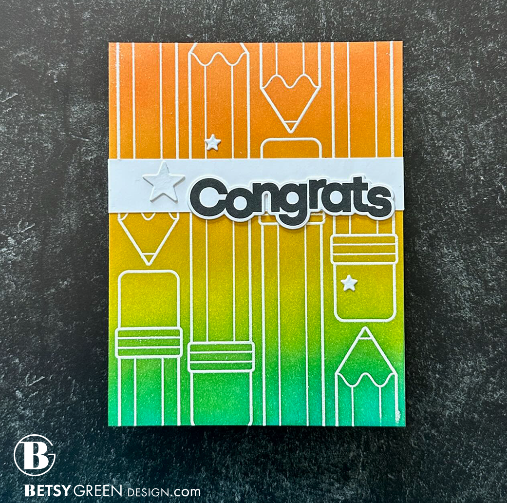
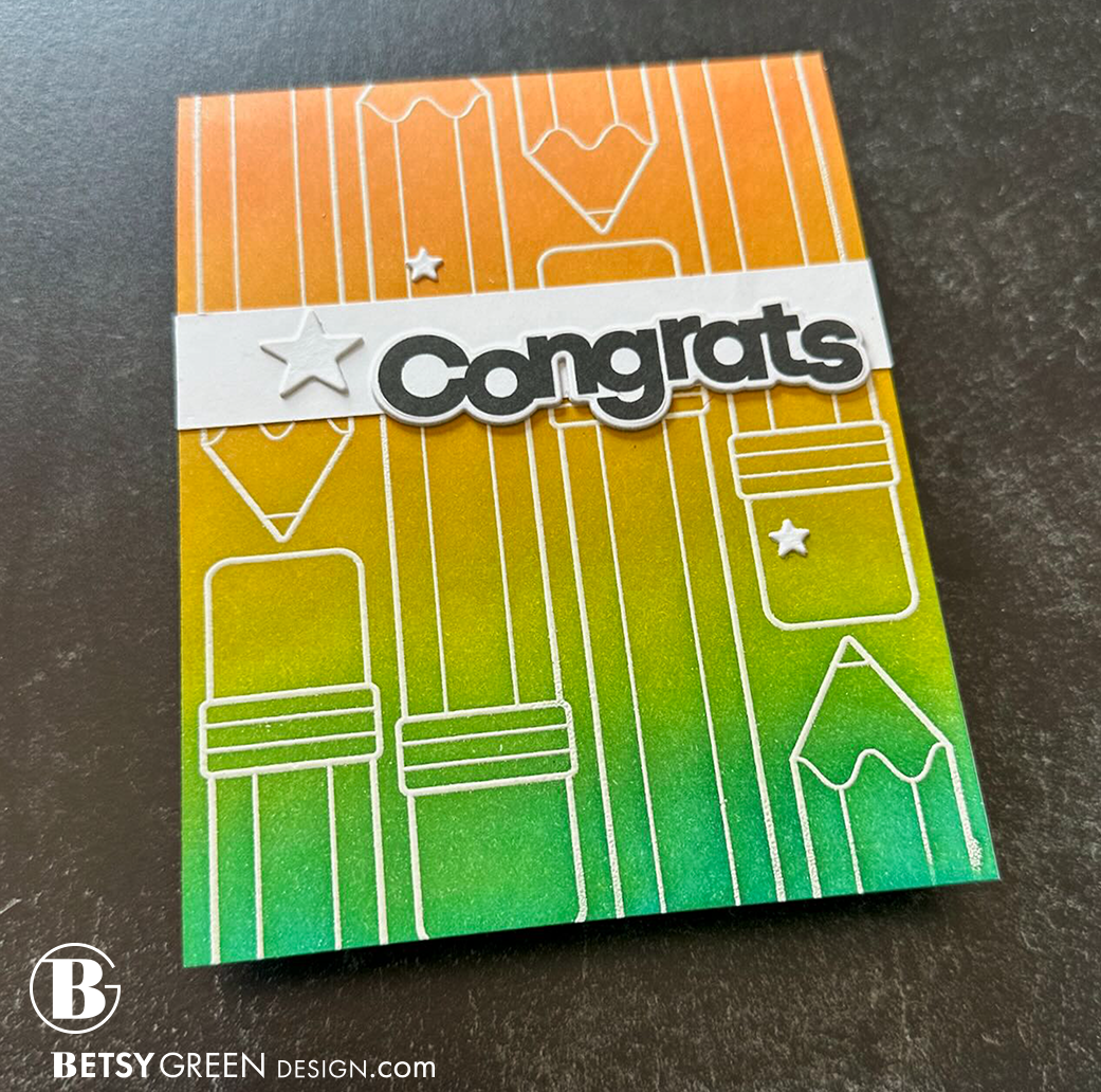
I wanted a bolder color for this third version, without a white background. White is the detail here, rather than the background. (The color blend on this reminds me of a saturated snow cone, but I didn’t pick the colors for that. Just an observation after I blended.)
Techniques:
For this one I stamped and embossed it white, so I could ink blend the background over that.
The bold sentiment stands out well because of the contrast with the thin lines of the background, but the horizontal white strip also acts as a grounding base for it. There’s also some energy that is created with the perpendicular lines of the background stamp and this white band.
Colors:
ink: Concord & 9th Pink Clementine, Sunflower, Lemongrass, and Peacock.
Thank you for visiting! Take some time to check out this new release if you have a chance.
I hope you get some time to create something soon.
Links are below if you’re interested in any of the products I used.
*Affiliate links do not cost you any more when you shop, but it is beneficial to creators when you use them, so thanks in advance!