Welcome, and thank you for visiting!
Thank you for stopping by my new blog. I promise there will be a lot more to come, but it was time to make this happen. Everything has to start somewhere, right? (I can only do so much perfecting it in my head…) I hope to share design tips, techniques and shortcuts that work well for me, inspiration examples, and overall, expect lots of fun and colorful creations.
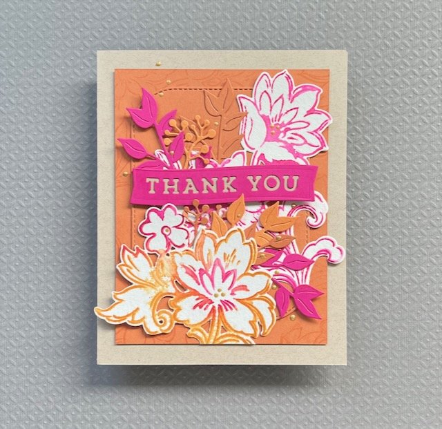
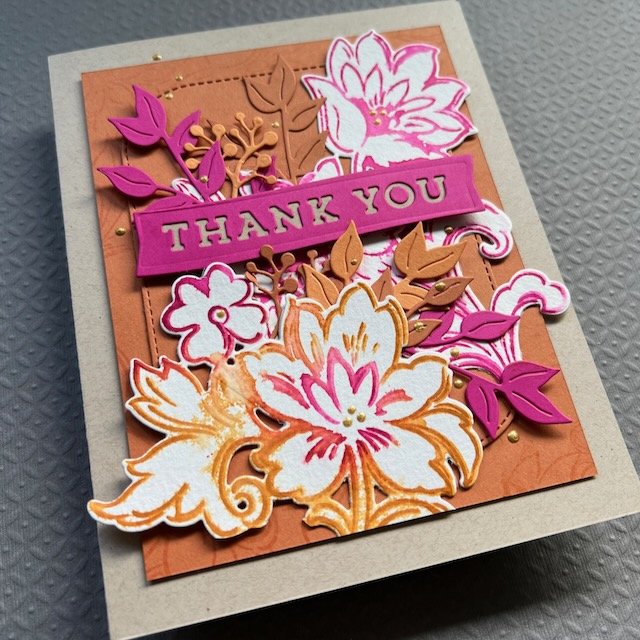
To start, I’ll share this Thank You card I made recently. It uses product from a few great companies, and seems perfect for this time of year where so much feels like we’re on the edge between summer and autumn.
Great floral stamps like this set from Altenew are easy to use any time of year - mix up the color, the technique… there are so many possibilities. For the background layer (base layer of the orange “Spiced Cider” cardstock) I stamped some of the floral images around the cardstock piece so they would show along the edges. (TIP- If you do this with a single stamp, be sure to rotate it as you go so each stamp impression isn’t lined up the same way. That makes it look totally different, especially in a situation like this where you don’t see as much. You get more patterns and shapes from that single stamp image.) Once stamped, I adhered this background piece to the kraft colored card base.
For all the floral layers, I inked the stamps up with two colors of ink and then spritzed the inked stamp with a light spray of water before pressing them onto some watercolor paper. I die cut those, and layered them with some other floral shapes cut out of 3 colors of coordinating colored cardstock. I arranged all of these on a background shape cut with the My Favorite Things “Stitched Modern Rectangle Stax” die, cut from the same color as the stamped background piece. I used my favorite Gina K Connect glue, along with some strategically placed foam squares to pop up parts of them for good dimensional interest.
The banner is cut with a Concord and 9th die (Pretty Petals die set, from one of their In The Classroom events) using the same Dragonfruit colored cardstock that I used on some of the leaves. I backed the letters with a piece of kraft cardstock that I cut to fit. That little touch not only provides come contrast for the words to show, but also visually connects the focal point of the card with the base. The final touch was some gold Nuvo drops to add a little shine.
Thanks for reading! I hope to see you here again soon.


